Here you’ll find images I had archived as sources of inspiration. My hope with this page is for it to give some transparency to my practice and to share with others these delights.
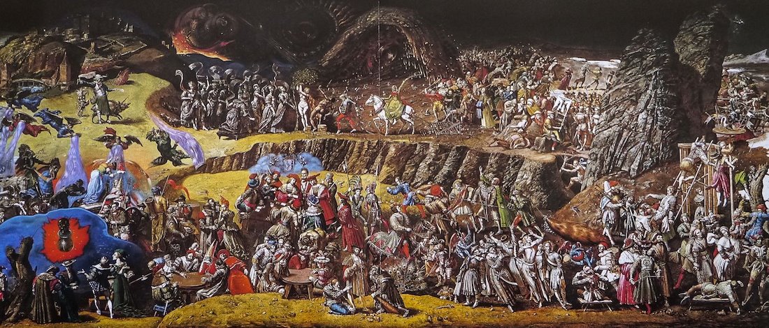
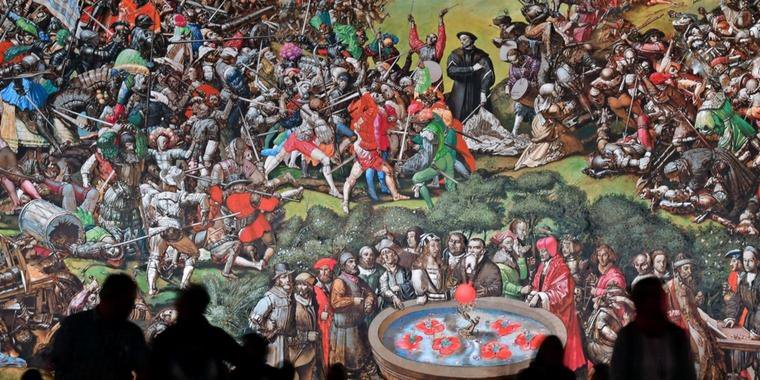
Werner Tubke
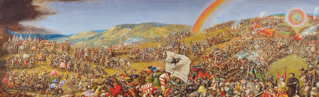
I have been looking at Tubke’s work recently as inspiration for future crowded paintings.
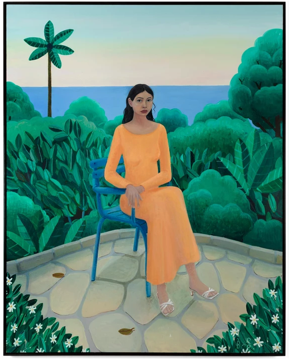
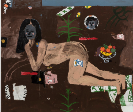
BEN SLEDSENS
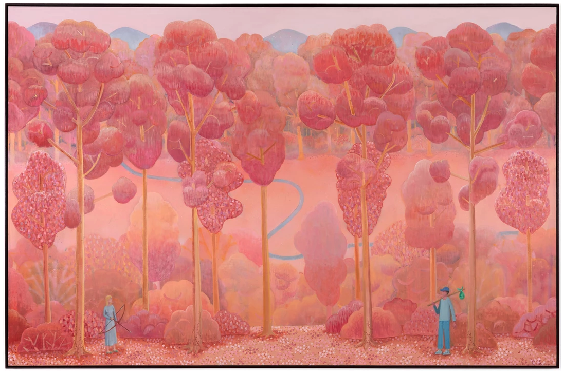
I like the tension of the moment captured here. I also enjoy that it is the woman holding the bow. Also really admire the play with colour, the monotonous pink and orange forest cut by the blue river and popping the characters in the foreground.
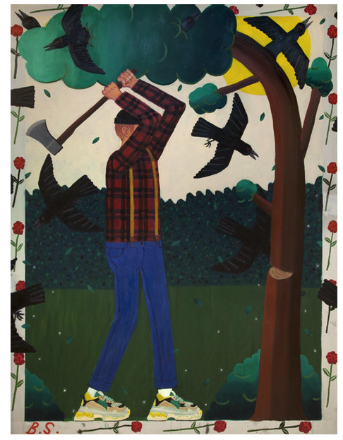
Love the frame, the overlapping crows mess with the perspective of the frame and makes me think of the relationship of a frame to picture.
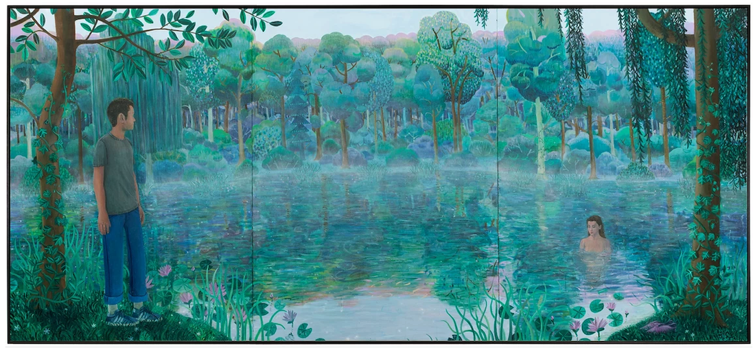
For me this modern day nymph painting while referencing Monet’s garden? two references I quietly love. Titled Morning Encounter.
Kai Althoff
very drawn to the simplicity of composition and symbolism
love the flatness and monochromatic palette
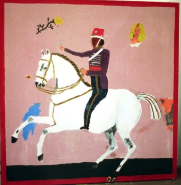
Danny Fox
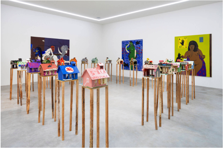
Really interesting presentation of paintings and smaller sculptures together.
So drawn to the flatness and limited colour palette of this painting.
I like the ornamental aspect of all the smaller forms surrounding the portrait.
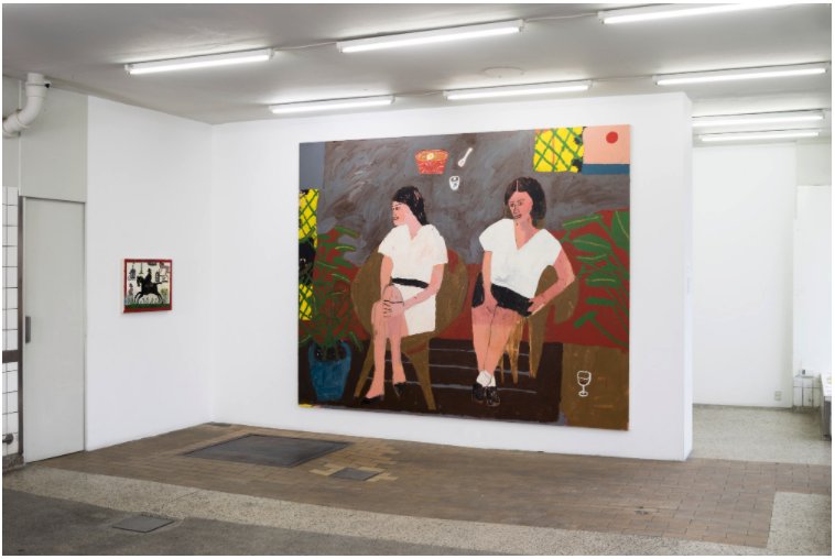

Image able to be looked at both ways, I could use for a symbol of duality


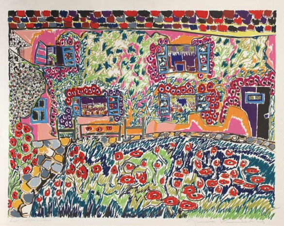
I have always loved the images of New Zealand painter Karl Maughan. He is most well know for his depictions of gardens in bloom. I was always drawn to these images as it feels like you are able to tuck yourself away around one of the bushes and hide from the world for a bit. I started thinking about these paintings again this morning as I was trying to think of images that had an overall attention span (where every part of the composition is as equally engaging as the rest), much like the visual experience of looking at a pattern.

Recently I have been embracing my love for design in my paintings so I decided to do a small study of what stands out to me and try discern what it is I like from advertising specifically. What I take away from this is strong presence of text, high fashion and ‘low’ culture combined/contrasted, simple compositions.
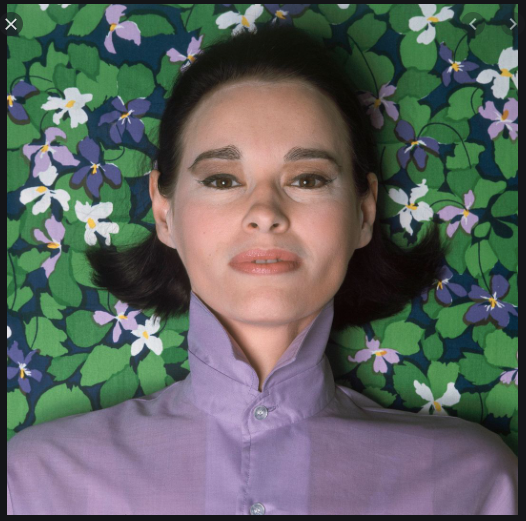
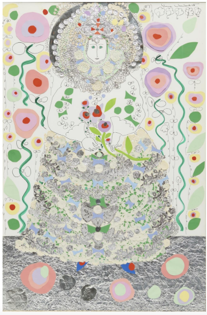
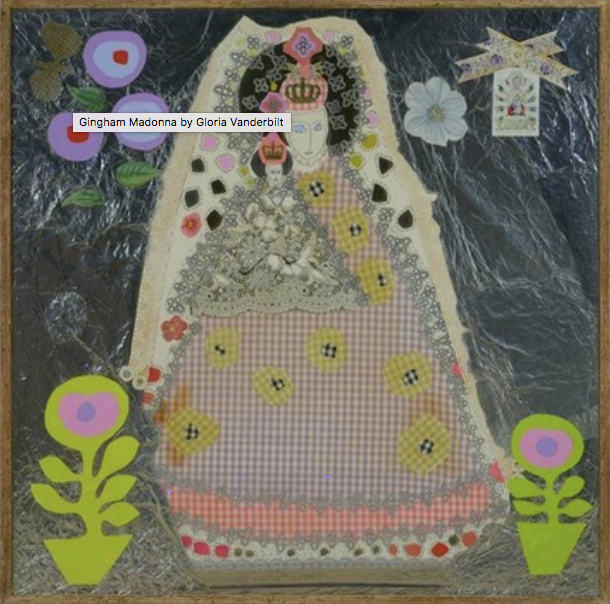
Gloria Vanderbilt – Part of the Pattern and Decorative movement. She inhabited the need to plaster texture, colour and pattern in to everything (look up pictures of her house). Excellently eccentric and feminine work with no apology.
I wrote this story after a tutor suggested it could help me communicate the narrative I am trying to touch on with my work. It's a very rough fictional story that touches on many of the ideas and concerns that continually bounce around the inside my head.
Just like every other Alice’s story starts, Alice the 23 year old art student had just found herself on the ground, after having fallen down a rather long rabbit hole. It was funny, because at first the world Alice found around her, looked much like the one she had just fallen away from. As Alice looked around however she started to notice slight differences, the colours were a little more rich here (even the greys more grey) the people, everyone had distinct faces and fashions (the last world, everything and person seemed to blend into a slush when congregated), the tall buildings seemed taller and the sounds a cacophony swirling around Alice rather than a slur. It was just the same, really, as the last world but it was like Alice had taken off her bootleg muimui sunglasses, the world wasn’t suddenly so different it was startling, like you would get with the UV grade authentic pair, but there was a difference. As Alice walked around this new world every sense felt over stimulated, the sounds of people conversing, cars honking, birds squawking, beeps, clangs and yeeps from every direction. A baby in a buggy is pushed past Alice, it’s face distorted into an ugly scowl as screams came out of it’s oversized mouth. On the canal is a swan, poised beautifully on the water, floats past, a royal procession of one. A homeless man sits in front of Zara with a sale. A Jazz band entertains a crowd on the street. A Starbucks cup gets chucked out of a car window. A water droplet caught in a spider’s web between two bins catches the light. A group of school kids gather around a shop window, Alice looks in passed the glare to see what they are gawking at. It’s the latest iPhone release. As Alice continues down the street there are advertisements and posters in every direction; Vans shoes, climate change demonstration, lynx deodorant, neon colours, Aldi, Bernie 2020, a man outside the florists picks out a bouquet of flowers for a special someone, slimming world, a Cara Delavine perfume, Better energy savings, Buster is lost! Call 0226967639 if found, Mitsubishi aircon, Dyson hair dryers, are your pores too big? Try Neutrogena, Smart Water, reds that make you hungry, a bowling alley is closing down so get in before you can’t, H&M has a sale, Sketchers has a new sneaker, always wanted to charge your phone wirelessly through another phone? Buy Samsung! Coca Cola, swoosh, Seaworld, KFC, Cannon, swoosh, hair loss? PS4, speech therapy, swoosh, spray tanning half price!
It’s starting to get dark so Alice turns down a few side streets before ducking in to a small bar with three drooling dogs sitting in the window. As Alice tries to pass through the crowd a man barges the other way knocking Alice on his way through with no reaction to her fall. Finally at the bar Alice orders a beer and is soon joined by a young man, He looks nice so when he starts chatting Alice, Alice chats back. Later Alice is alone in the bar again. A group of men surround her, one is telling her at a high volume that the bald guy “is a really great guy” and to chill out. Alice pushes past the men, yeah I really trust a white guy with tribal tattoos Alice thinks to herself. Noticing that the atmosphere in the bar has changed since being stationed at the bar, Alice looks to the stage, there, a drag queen is preforming 9to5 by Dolly Parton, her red dress dazzles under the clunky stage lights. The lips she has drawn herself are mesmerising as they capture every syllable and breath of the song. Next to her, Alice hears a couple falling in love. A group on the dance floor sing with great enthusiasm and no tone, eyes closed and smiles plastered over their faces. When the number finishes, the queen tells the punters, panting heavily in to a microphone, to head to the bar. A man walks up to the bar in a wonderful orange and pink suit.
Within the text, I think you can understand ideas around the appeal and abjection of consumerism that I feel as well as the standardised language of advertising (literal language and visual language). Other than this, I also wanted to capture the feeling of being overwhelmed and scared of this life/world while simultaneously being in awe of its brilliance and beauty. There are also parts hinting to the bending mainstream gender roles and sexuality within our society.
With Pleasure: Pattern and Decoration in American Art 1972–1985 – "the Pattern and Decoration movement’s defiant embrace of forms traditionally coded as feminine, domestic, ornamental, or craft-based and thought to be categorically inferior to fine art" It comforts me to read this while researching patterns in art. I find it hard to ground myself anywhere in art history or culturally as I'm not from anywhere, not from Dubai, not from New Zealand and not from England. I have no where to draw inspiration from which is a part of me already. But reading this I can ground myself in the act of crafting which I witnessed and was taught by my Mother, Grandmother and Auntie. I can also ground myself in my femininity and feminism, that feels like a cultural part of me.
https://whitney.org/essays/salman-toor-self-as-cipher – I really enjoyed this article on Salman Toor I read. It interests me learning the importance of art history in Toor's work as it is a mutual interest of ours, one in which I still haven't articulated properly in my own work. Also Toor's journey to finding a way in which his identity is truly shown through his art is very inspiring to me, I think the work is so striking because of its honesty to this identity. I feel like I tend to flatten myself in my work to make the work more relatable but in seeing this it is obvious that the more true to your own unique identity the more it connects with an audience, empathetic or not. The line "Toor had landed on a unique mode of working: one operating between academic painting and illustration, and between fiction and autobiography." really connected with me. Finding balances, similar to these, in my work is very tricky, like finding balance in anything.

Bratz Doll – I loved the crazy proportions of the dolls face and the attitude this plastic doll can ooze. It shocks and embarrasses me when I look at this how much I envy what she symbolises.

Old vase new skulls.


Very inspired by the fashions and forms of the 1970's barbies. Can imagine using them as references for portraits, I love an overly long neck.
Walk through my sketch book.
A presentation I put together at KABK. This was received rather well

From Faye Wong’s music video for If You’re Happy I am Happy. Pattern on pattern on pattern make my mouth water and I love the low-fi quality in combination with the text.


I saw this plant on a night time walk and was captivated by the colours and the form the flowers take on. The cascading movement they provide is very dramatic, almost Renaissance-esqe.
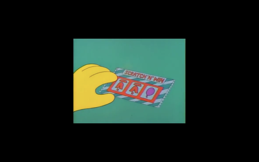
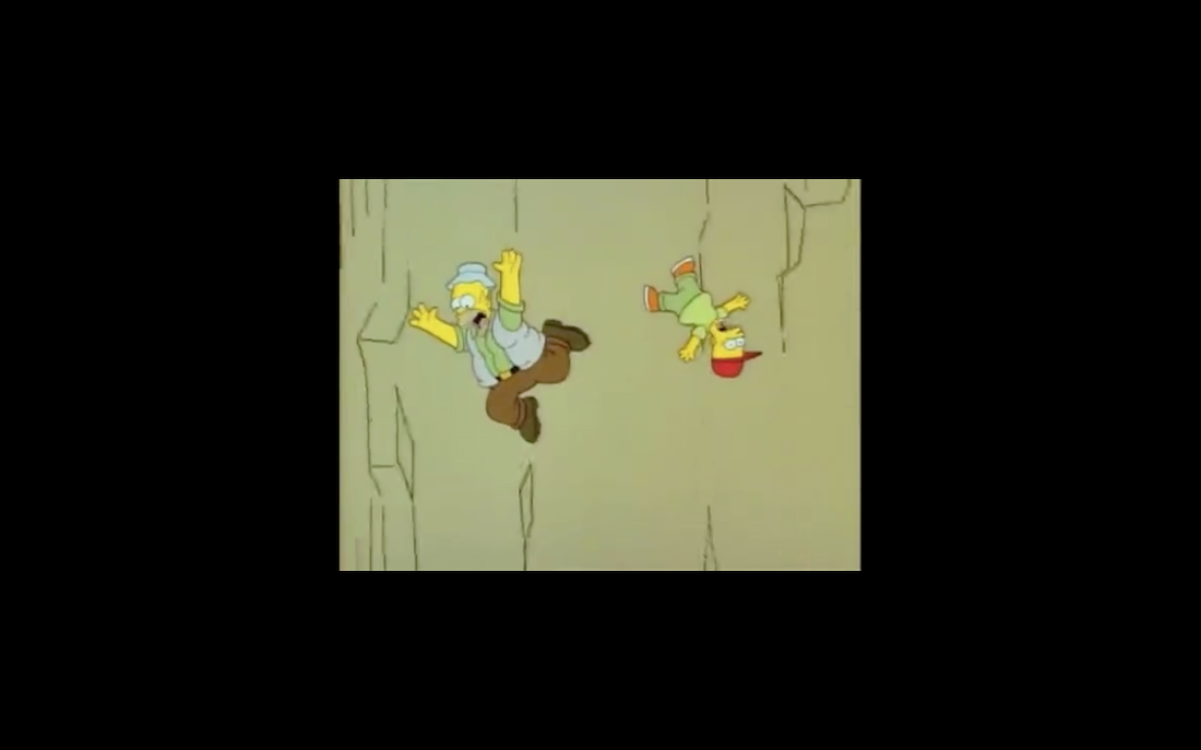
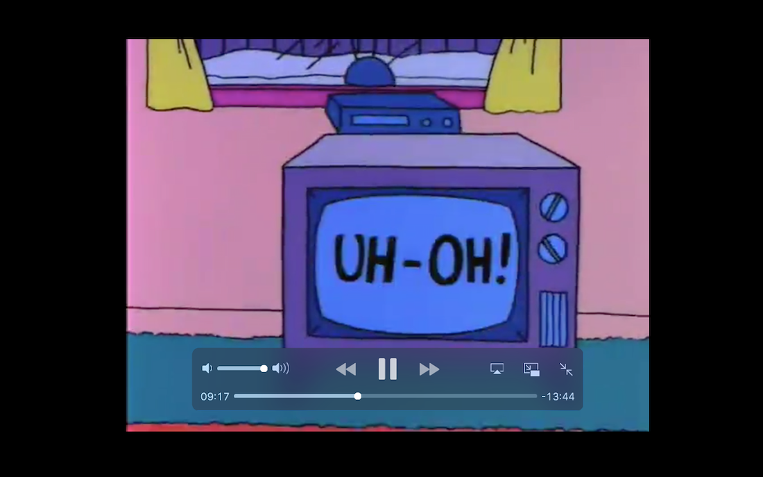
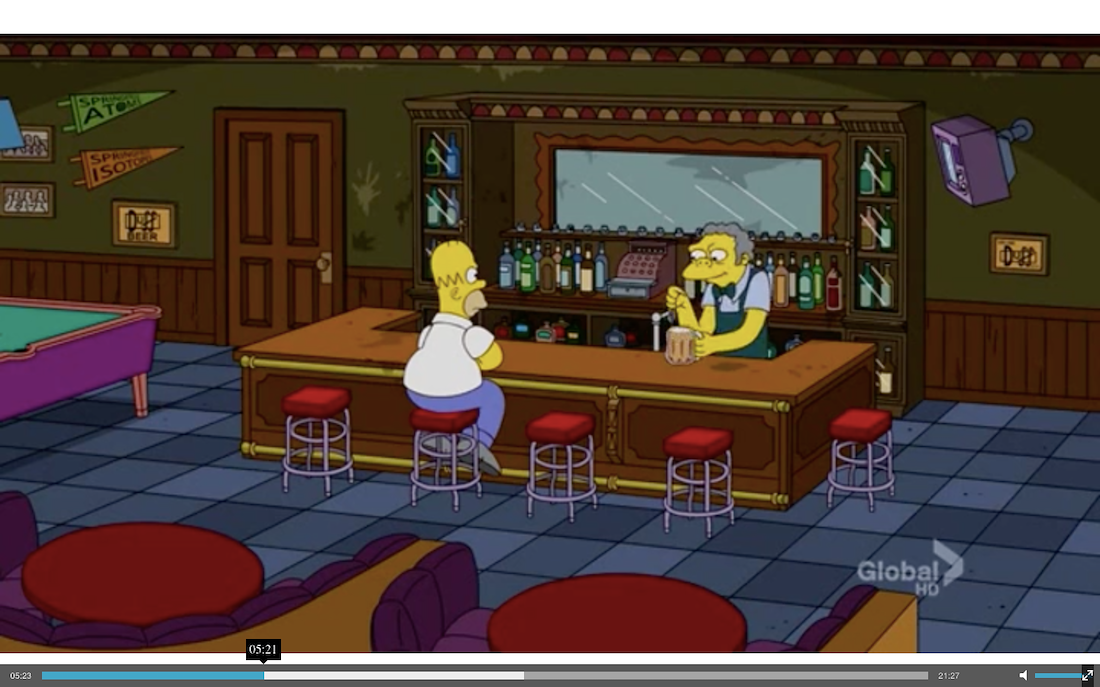
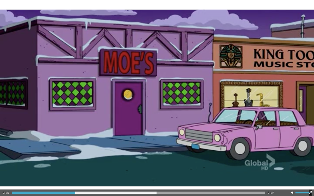
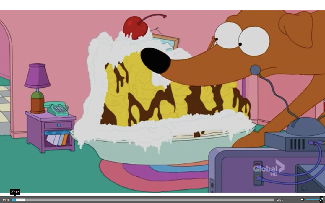
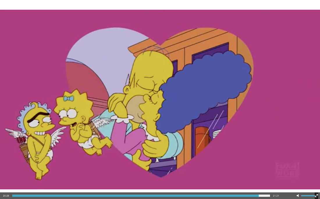

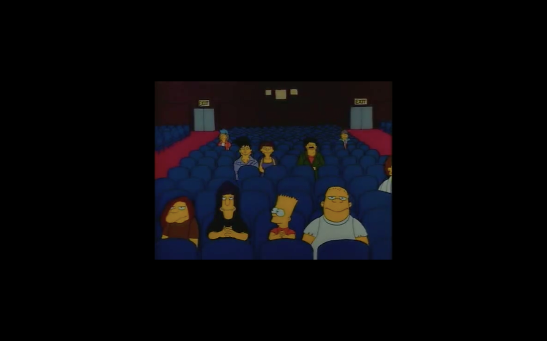
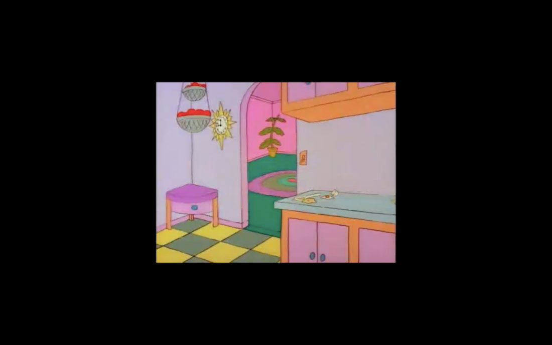
I love screen shotting episodes of the Simpsons, some of the still are so crudely cartoonish yet so beautiful to me. My love for the Simpsons (more so early) comes from this and the political satire weaved in to a family show.


Very inspired by the childish femininity van der Stokker decides to use. She has also seemingly pefercted translating her drawings into paintings while still seeing the drawing in the final work, something I strive for.


Koen Taselaar is an incredible artist to me, his work is so enthusiastic and happy that it feels tongue and cheek with series named Imaginary Band Names and Annoyed Architecture you know you are in for a laugh. The execution of his drawings are so detailed and textural and the colours so bright and well balanced that it’s easy to spend a long time looking over everything.


I find Ben Orkin’s strange, beautiful forms so mesmerising. His concept to translate gay relationships in to ceramic objects is very interesting to me.


Screenshots of Trixie Mattel’s music video for Yellow Cloud. Loved the papier-mache forms, simplified portraits and incorporation of pattern.

Instagram filters by Ines Longevial I was attratced to. Something about the patterns and child like drawings on skin gets me.

Designs by Minju Kim and then I just liked Post Malone’s Dorrito Jacket.

Fell in love with Slattery's work when stumbling across it one late night google. His use of the classic comic, Dilbert, for a symbol of the disillusioned little man, in combination with political themes is just genius to me. https://www.youtube.com/watch?v=akICiweAF8U


This so captured the duality of life I try to address in my art. The push and pull between the importance of you caring for life around you and caring for yourself. The big and the small, still both need to be taken care of.


Notes I took from Patterns in Design, Art and Architecture.
(you can zoom in once you have clicked on the image)

Decorated locker I loved at school


I saw all of these at the Kunst Museum, Den Haag, in one day and realised I had a love for green and purple together.


Margaret Kammerer’s (claybowl on Instagram) work is right up my street. It is playing with the basic archetype of the vase, it is kitch, it incorporates symbols, plays with presentation, the sickly sweet and the endless inspirations you can see in the work are many things I like in art.

OVERWHELMING PATTERN


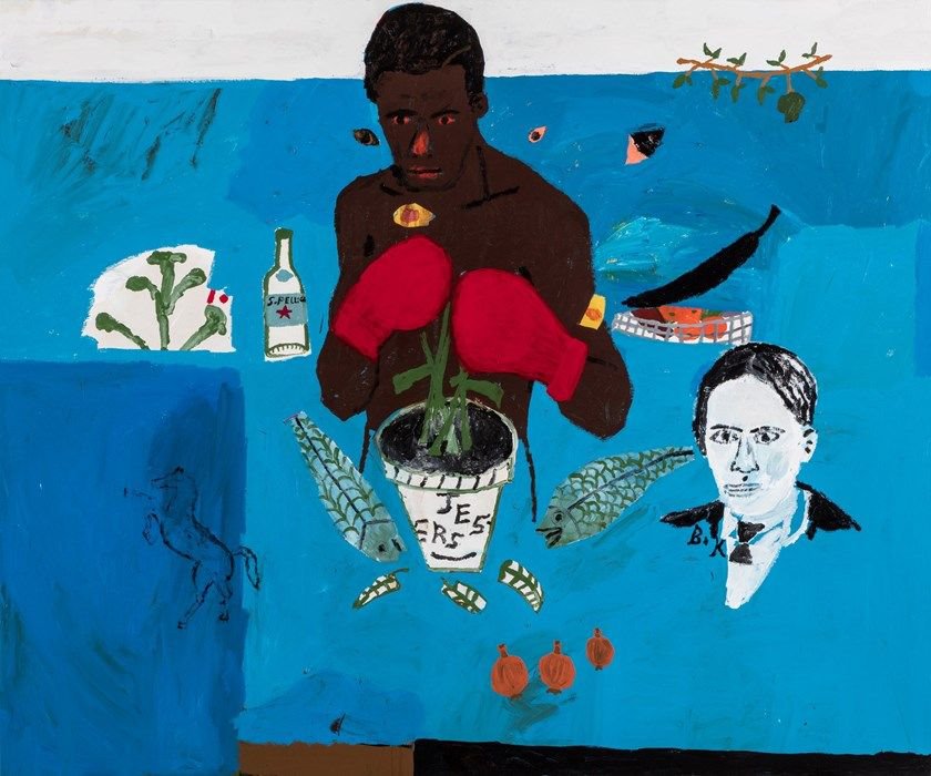
The work of Salman Toor is heart warming and so beautiful to me. A queer Pakistani immigrant in America is not an easy set of cards to be dealt, Toor uses his art to explore gay relationships and identity as a whole in his paintings. The illustrative scenes are so emotive and have so much movement, they really capture young adult culture.


Viktor and Rolf are one of my favourite fasion designers. I love their obnoxiousness ; OVERsized silhouettes, colours, text, iconography. They crate such strong works of art that are still very girly, I like that contradiction.

Have been drawn to the In-n-Out t-shirts since I first saw one my friend had in high school. I love the exaggeration and exuberance of the designs I think.

Texture and distorted portraits.


Claudia Kogachi – I love this work as I love the two dimentionality of it, the lines, forms, colours, action. What is there not to like about it?!
Ad Gerritsen – I saw his retrospective at the Kunstmuseum, Den Haag, early 2019. I was very inspired by his flat, animation style portraits and use of iconography and text.
I loved the simple, almost mathematical composition of this painting. Painted water has also always been fascinating to me.

I like the use of mythical iconography as well as the incorporation of a Marrimeko-esque pattern. The dual tone of paint stroke is an effect I really enjoy in many artists work, its used well here to texture the large plains of colour.

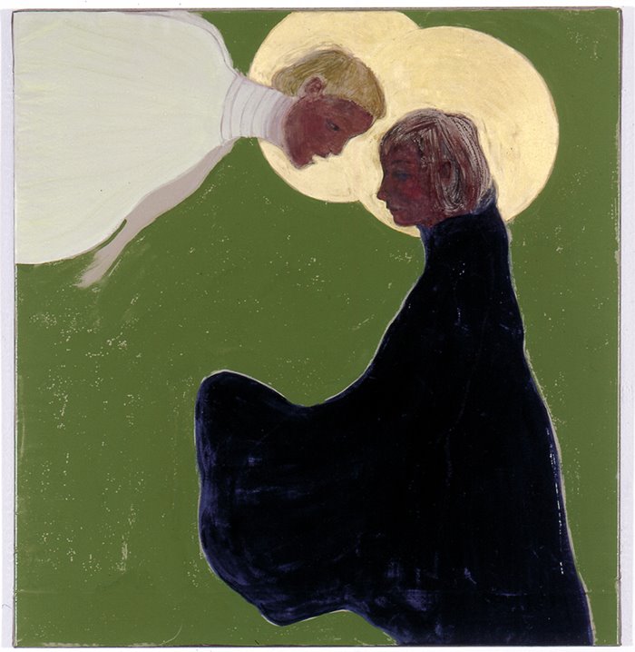
I loved the halo in this painting. The way Gerritsen has suggested it with the lighter tones just in the leaves, yet you still see the round shape is very intriguing to me.

This portrait was interesting to me as I am very drawn to the office ring binder pattern used in the background as well as the combining of line, negative space, and colour. Gerritsen has weighted the painting very well so the blank spaces don’t feel like dead space with the green tongue grounding it in the middle.

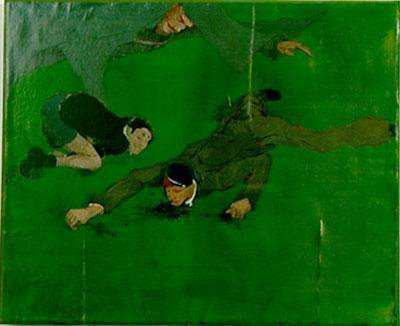
The pig head at the bottom of this painting was what really interested me about this piece. The strong, stylised lines that contrast against the painterly style of the rest of the painting draw your eyes towards t despite being at the feet of the figures.

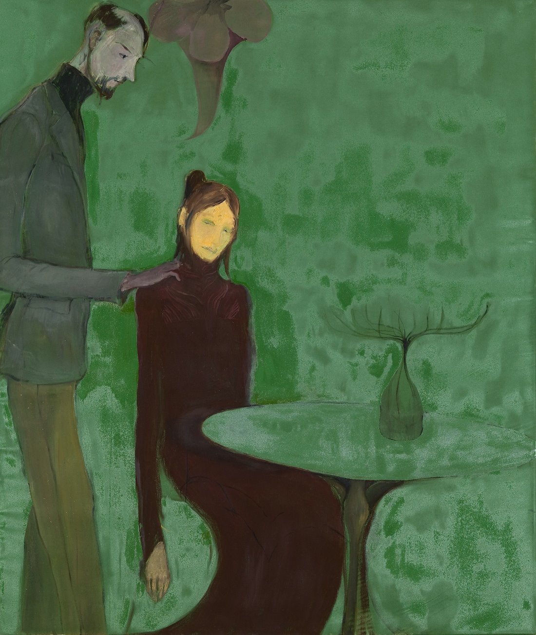
The melancholy feel to this painting was what initially drew me in to this painting. The colours, the large flat colour plains, the stillness and facial expression of the figure all contribute to this feeling. The composition is so simple but leaves you plenty to look at, it feels as if this really is a case of ‘more is less’; the absence of details gives you more to wonder.


Incredible ceramic piece by Katie Stubbs. Love the painterly quality she uses when glazing as well as the pattern and the excessive and symbolic handles.


Notcoolneverwas on Instagram – I love this work, the drawing is janky and the key to my heart. Her inclination for biblical themes feeds the art history nerd in me. The overlapping of characters add layers literally and conceptually, which is a nice way to use line drawings in a different way.


I have been a fan of Ines Longevial for a while now, I find her portraits so captivating, their segregated plains of colour creating harsh lines throughout the skin. Her incorporation of patterns ans natural motifs incorporated into the portraits are so beautiful to me on a cellular level.

Gerhard Munthe – Saw this piece in a gallery in Bergen. Love the style, reminded me of Rousseau’s work. Also was shocked by the added ‘jewels’ which were so fun!
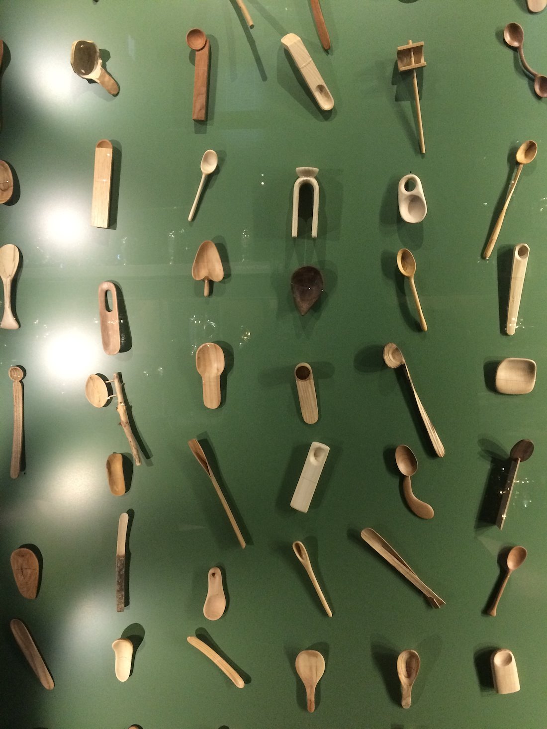
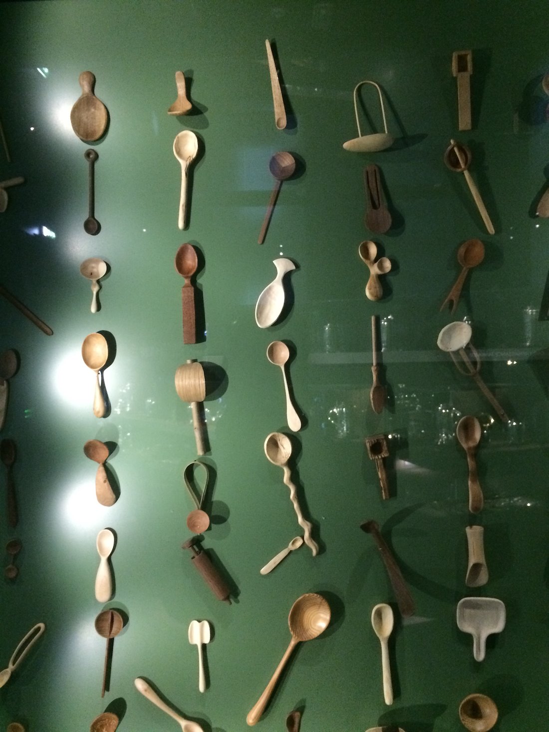
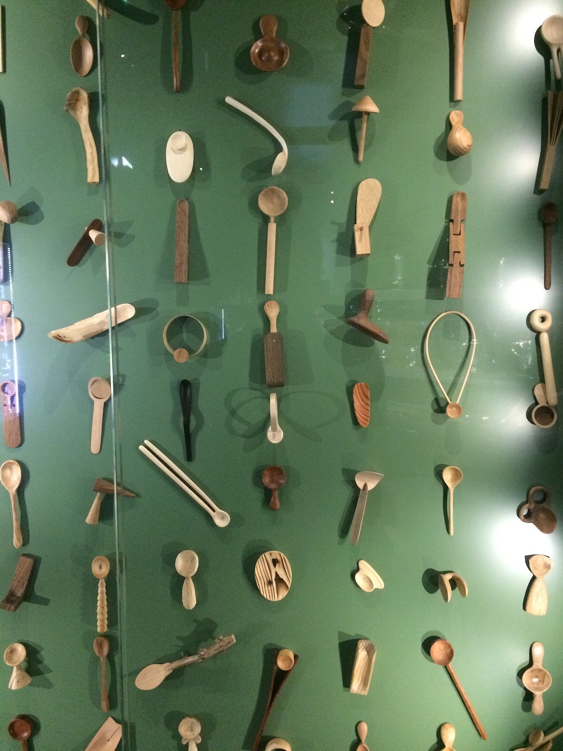
Selection of desinged spoons I saw in a museum in Bergen, Norway (unfortunately can’t find the name). I love spoons because my grandfather was Welsh so collected Love Spoons and my Dad also happened to bring me giant spoons from his world travel when I was a child.

Grotesque and beautiful, like looking at a modern Picasso for me.

I love photos where eyes are half closed, such a common dissapointment of the age of film cameras. I think the nostalgia makes me drawn to them. Or I just like anything that looks a bit off or uncomfortable.


reoccurring images, almost creating patterns in places.

I have always been drawn to tattoos and flash sheets. especially liked this one because of the butterflies that aren’t made of butterflies. Not so sure why it excites me so much!


Here are photos of my mothers tiara that she wore one here wedding day (upside-down!) I’ve always been drawn to this object, since a child.

Surrealist, funny, camp, cartoonish, love!

I love the playfullness of these works but maybe the concept even more. Cave designed these suits so as to strip the wearer of any judgments people may make of them by not being able to see most of their physical attributes. The work frees people of stereotypes or preconceived ideas.

Love the texture of the airbrush. the patterned everyday objects also fascinate me.


Beatriz Gonzalez – Saw her show at KW Institute in Berlin. Loved how she used furniture as her canvas (all my art I imagine in a home already). the 2d style is something I also really appreciate about this work.


Objects I saw in the Wunderkamer, Berlin. I had never seen a cabinet of curiosities before so found this experience fascinating. I was very drawn to these miniature models of pregnant women who’s anatomy could come apart to see inside the belly. The reoccurring skulls where very nice for me in the cabinet.


Details of paintings I saw in the Gemäldegalerie in Berlin. I was astounded at how beautiful Bottcelli's Mary (bottom right) was, I knew people loved his work but I didn't expect it to be so breath taking and moving. Her beauty contrasting with her tears is something else. I loved the lillies and the halos in a lot of the work too.


Practical art, art & fashion, helping a good cause.

Love the abstracted, cut out forms and the texture the textiles are giving.

Memorising forms and such fun!

Tight reoccurring pattern, feels safe.


The visible brush strokes and sickly sweetness of the colours are what draw me in to Lassnig’s paintings.


The textures created in the paint and colour pallet was what first drew me to these paintings. I also enjoy the mundane-ness of the subject matter.


I remember seeing these paintings for the first time and being so dazzled by the obnoxious patterns incorporated.

Reminds me of Egon Scheile’s work. Love the illustrative quality and embrace of negative space.
The slight off-ness of the faces is what I enjoy most about Neel’s work.

Love How you can see the artist’s hand in these paintings and expression in the portraits over beauty.

The work of Ken Griffen is interesting to me as I enjoy his use of iconography as well as his contemporary style to watercolour. The show of his I was first introduced to was in Precint, found in Wellington, the theme of the show was how modern technology effects relationships, which I found really interesting.

I so enjoy the surreal and tenderness of Borremans work. It almost feels like a ransom note written with love.